HILL STANDARD
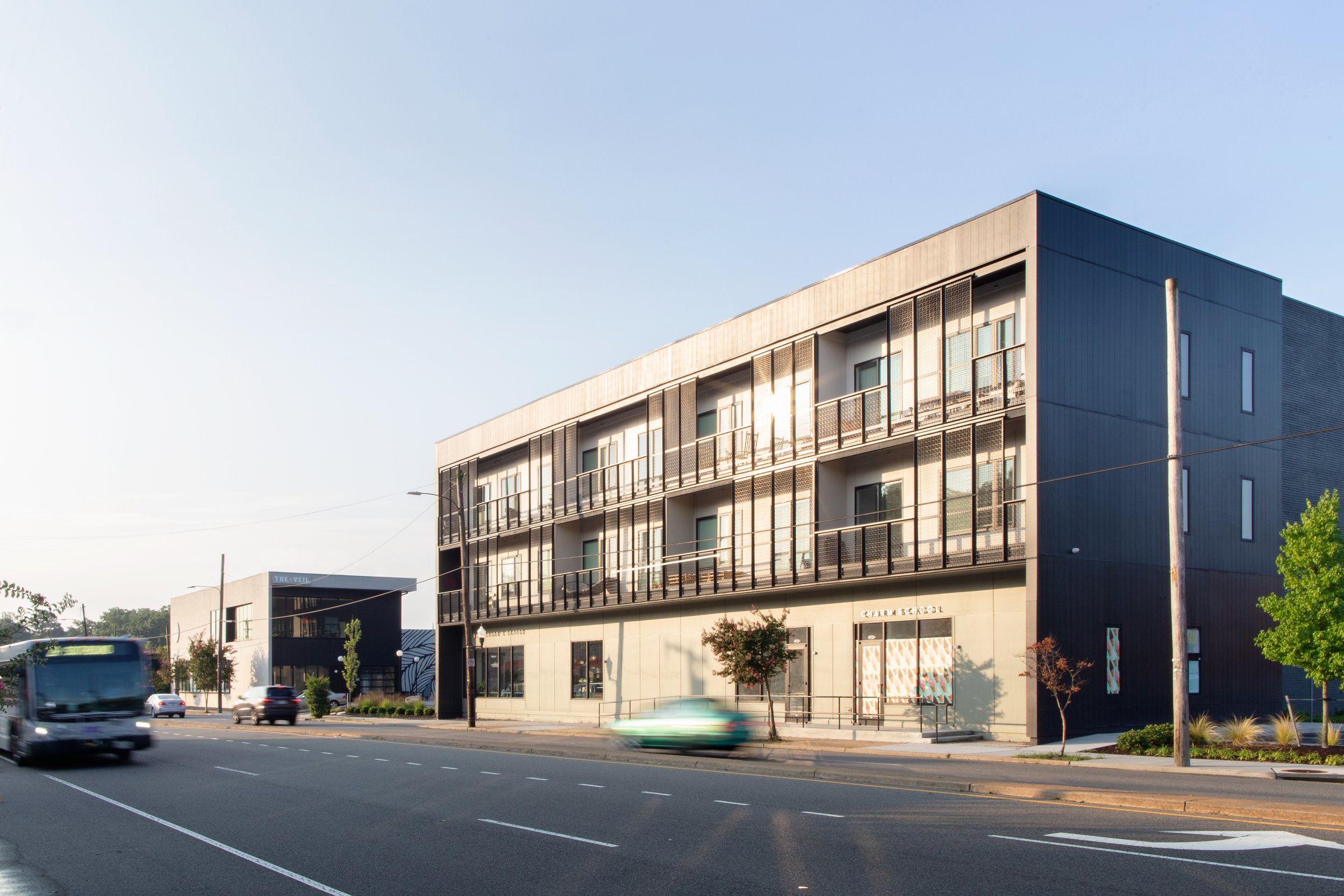
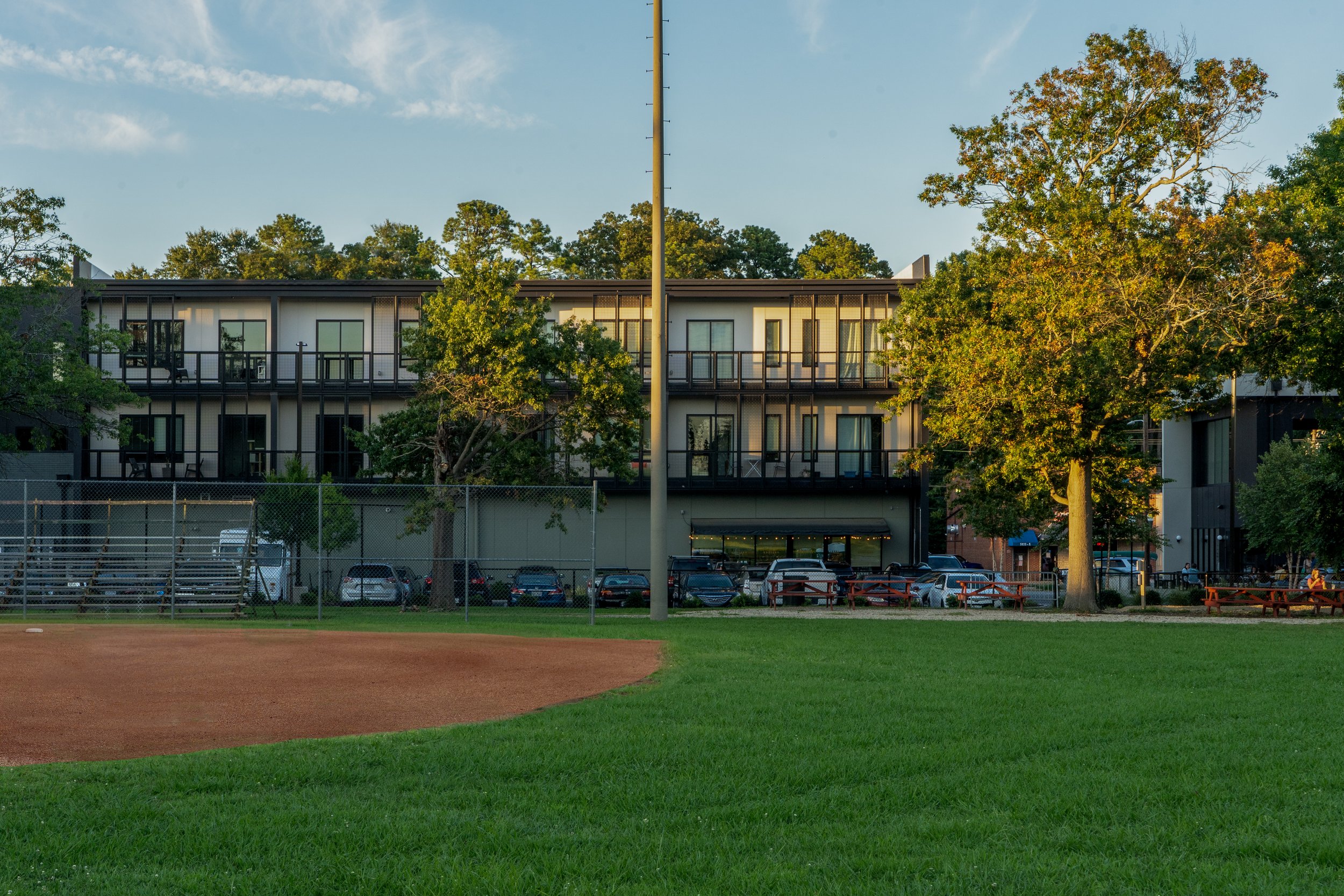
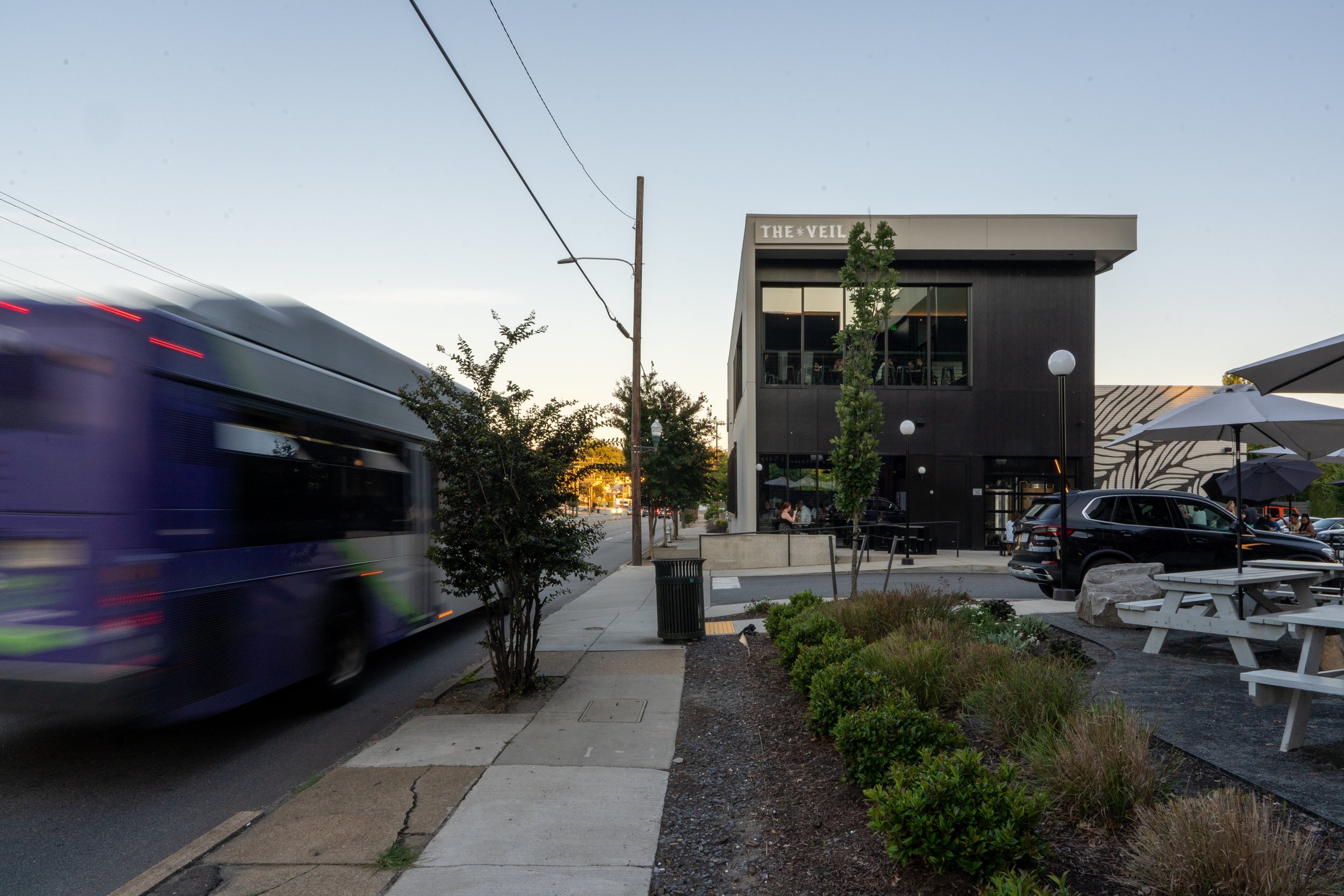
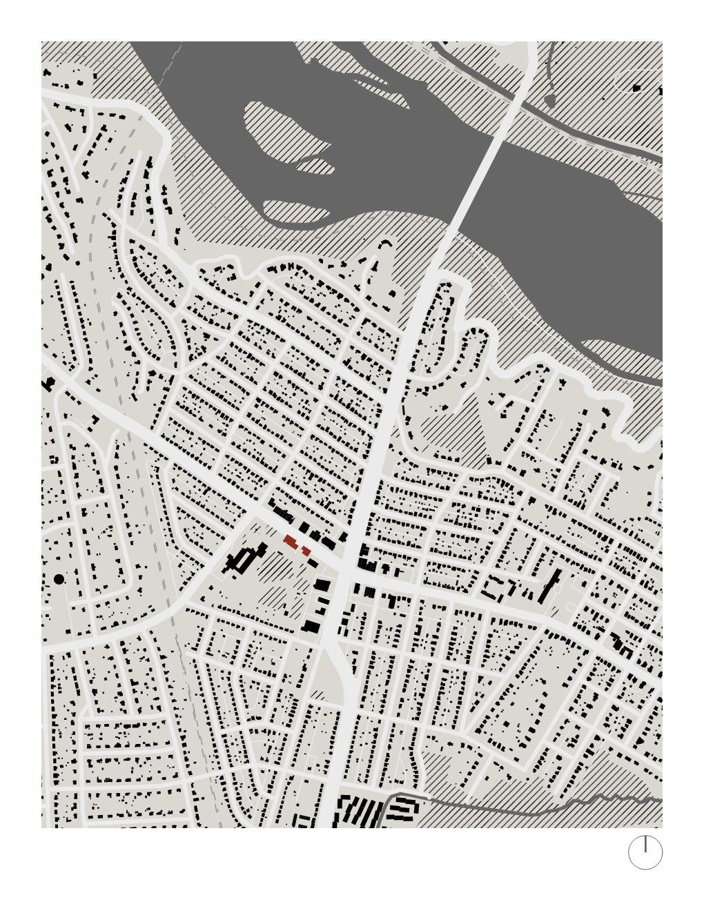
Situated along the busy traffic corridor of Forest Hill Blvd, the site had previously contained an historic drug store chain known as Standard Drug, which became the inspiration for the development’s name “Hill Standard”. Like the adjacent parcels, the site was originally zoned with the parking near the front, with a strip center retail in the rear. The new proposal sought to invert this paradigm by front loading the massing to the street, while also creating a portal for the public to take advantage of the green park space behind the site.
Part of a larger civic initiative to urbanize commercial districts in the City of Richmond, the Hill Standard + The Veil Brewing aims to achieve a balance of accessible local retail amenities, comfortable modern apartments, and shared, protected park space that forms a community gathering hub.
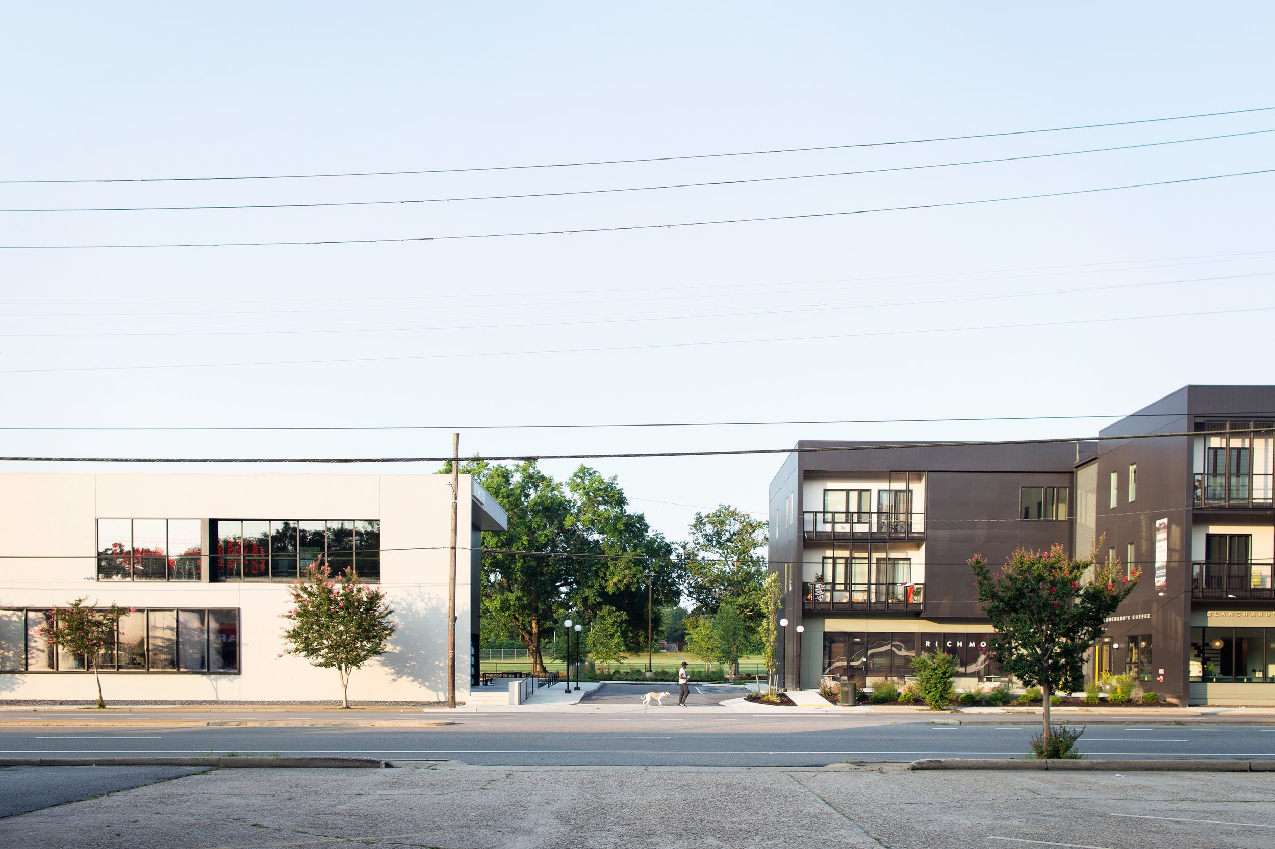
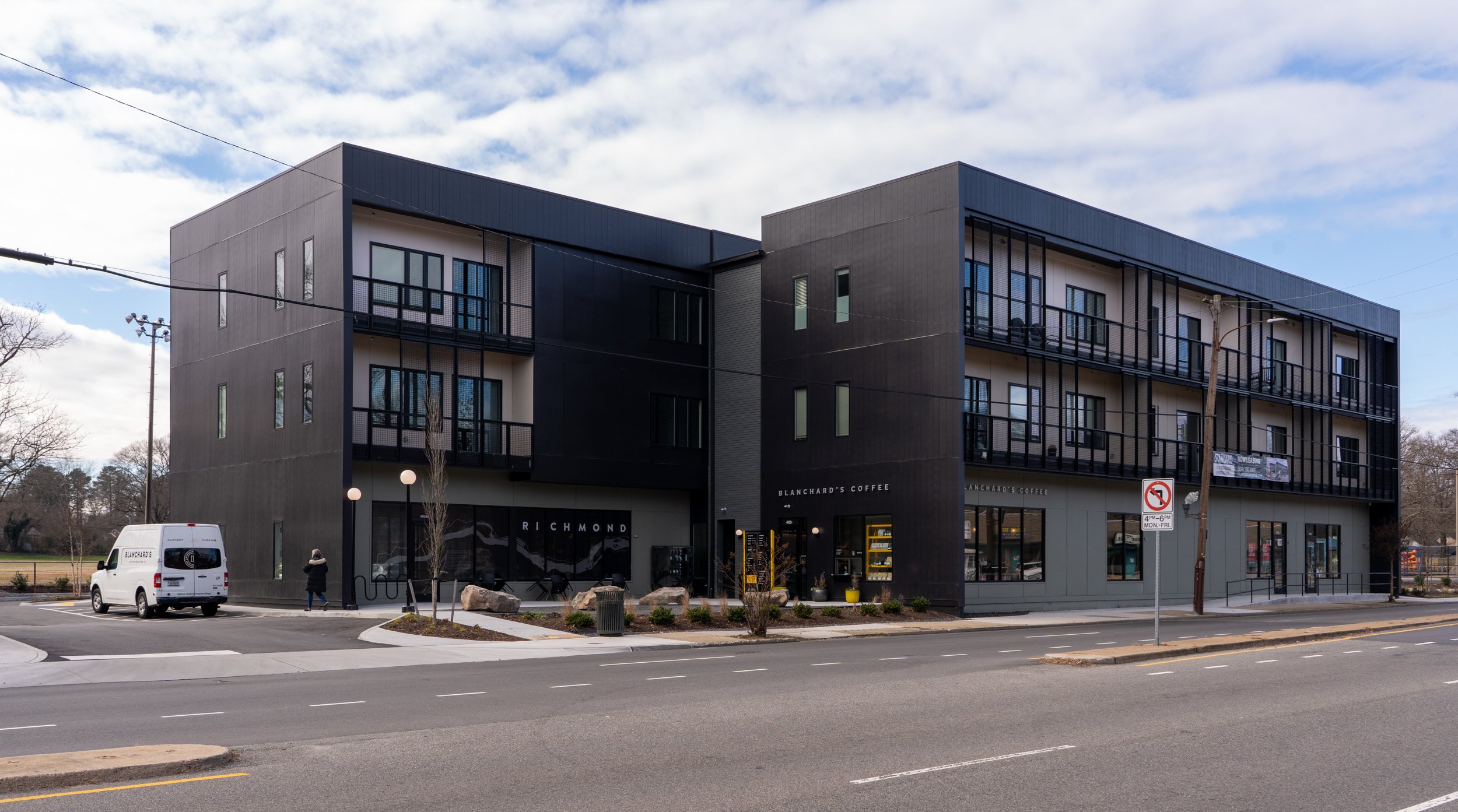
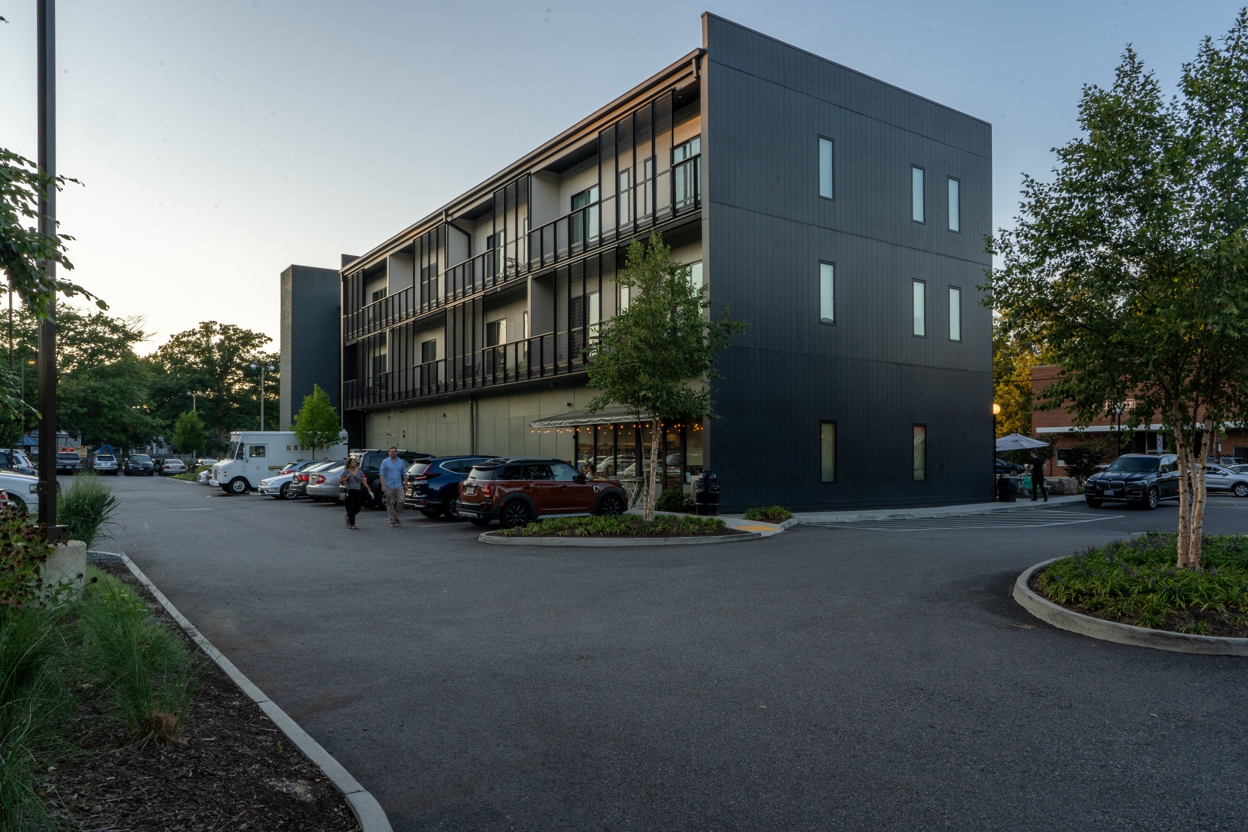
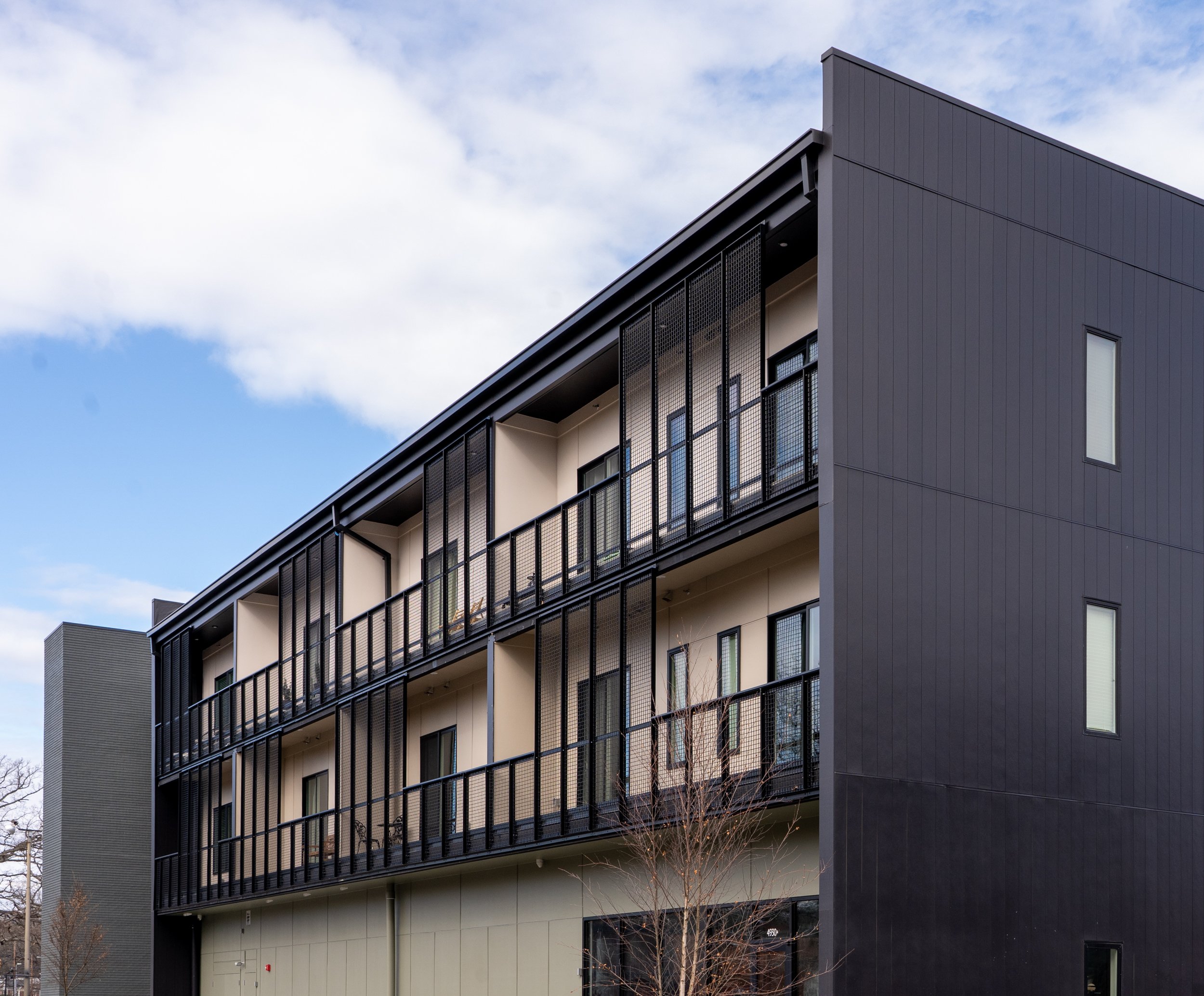
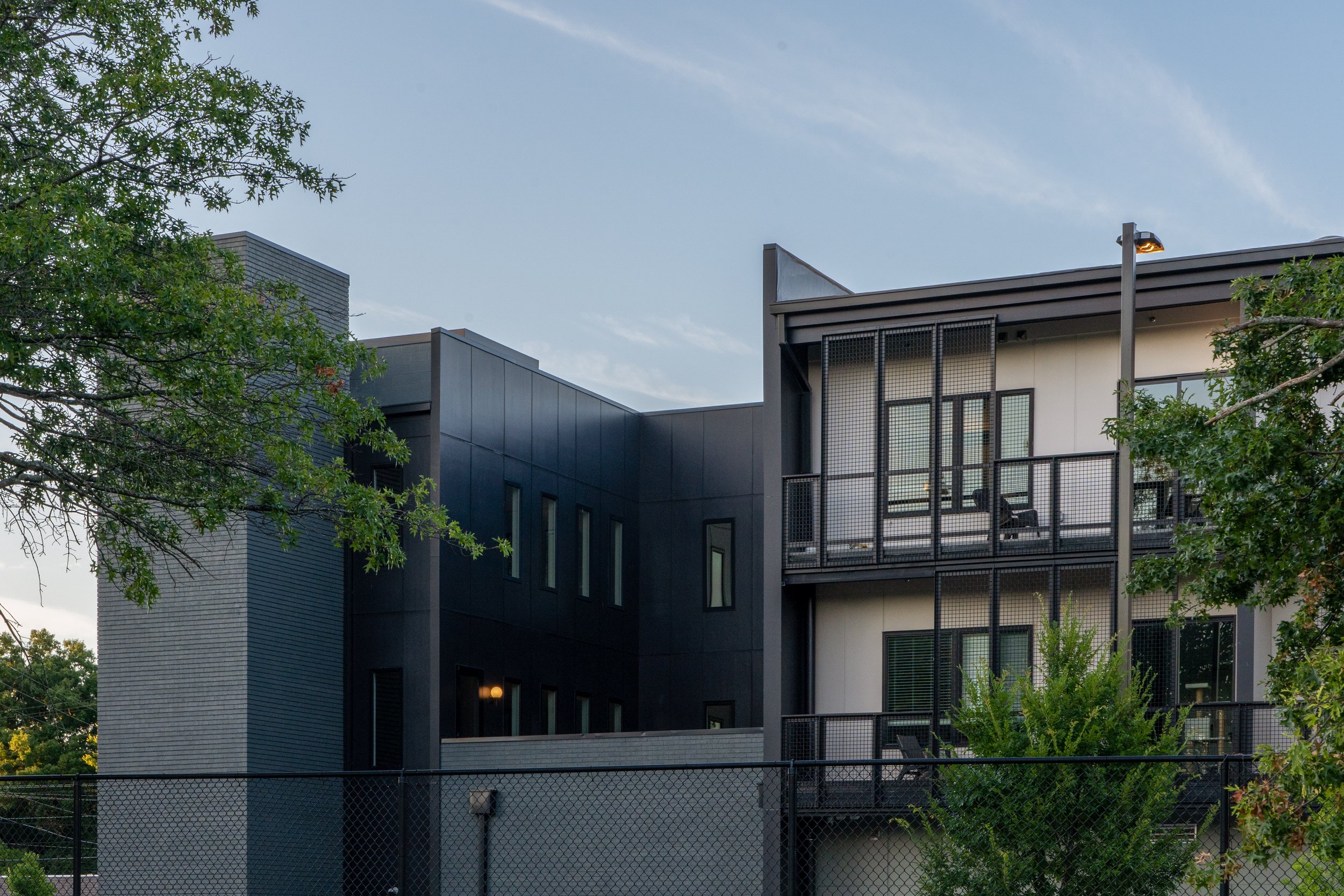
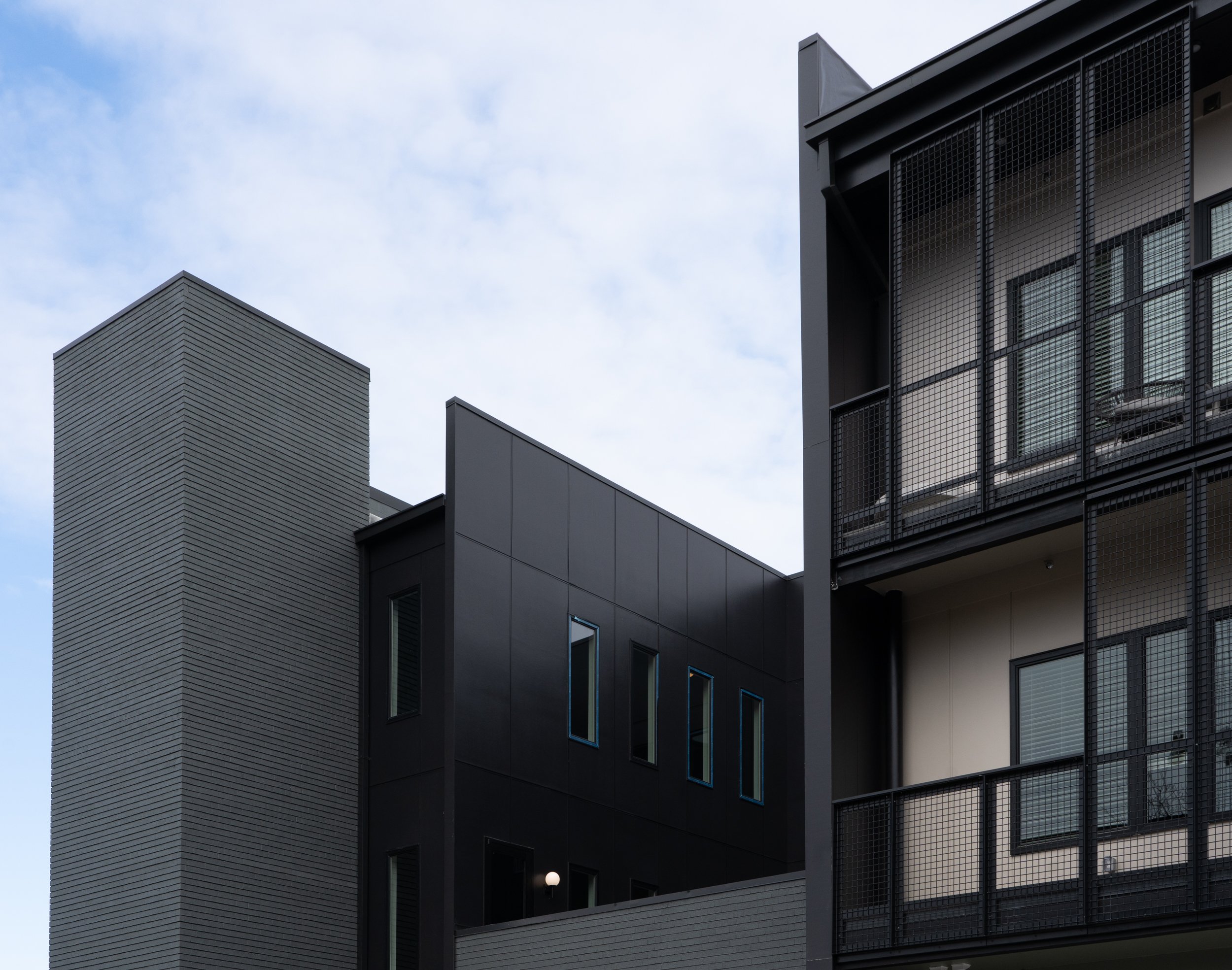
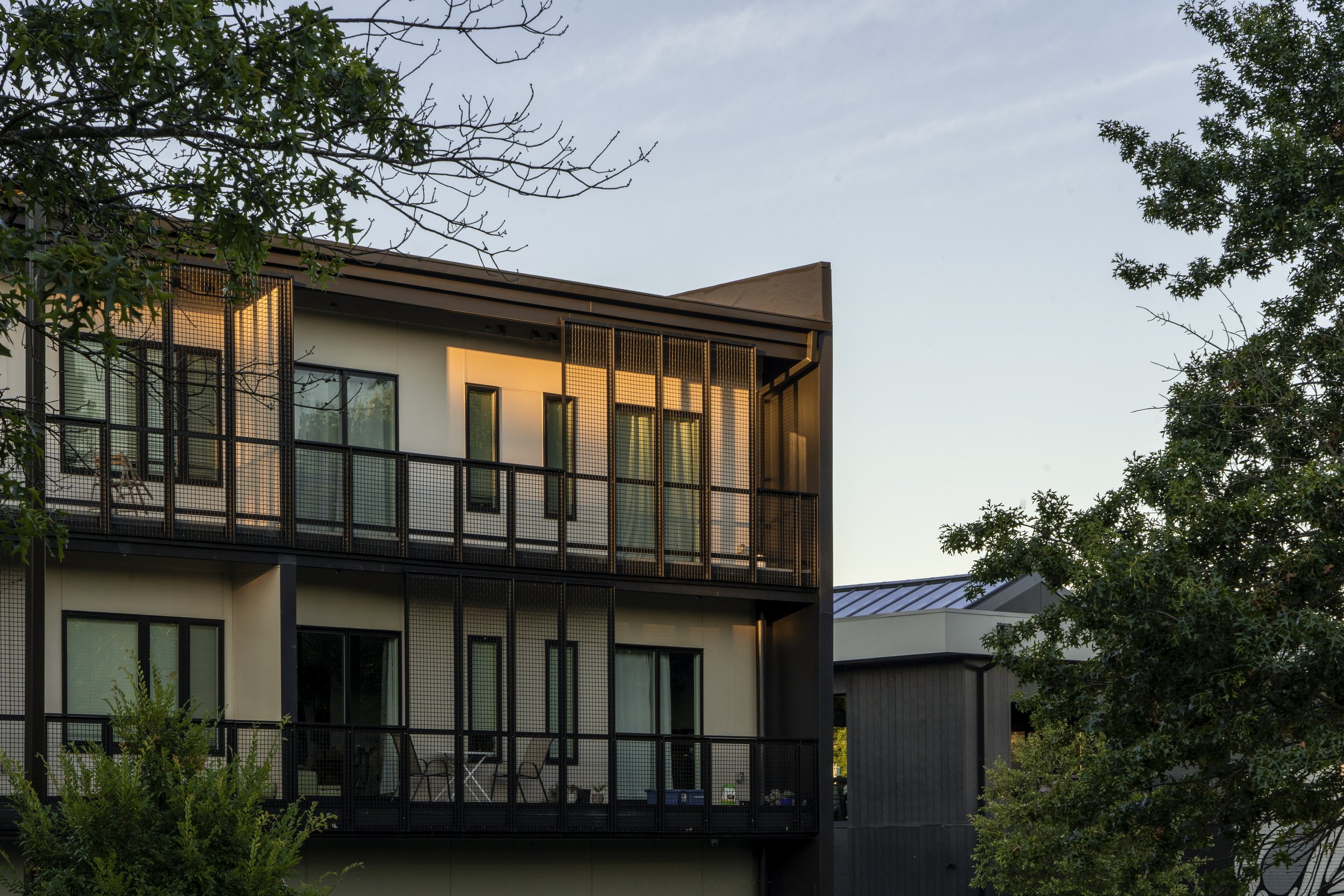
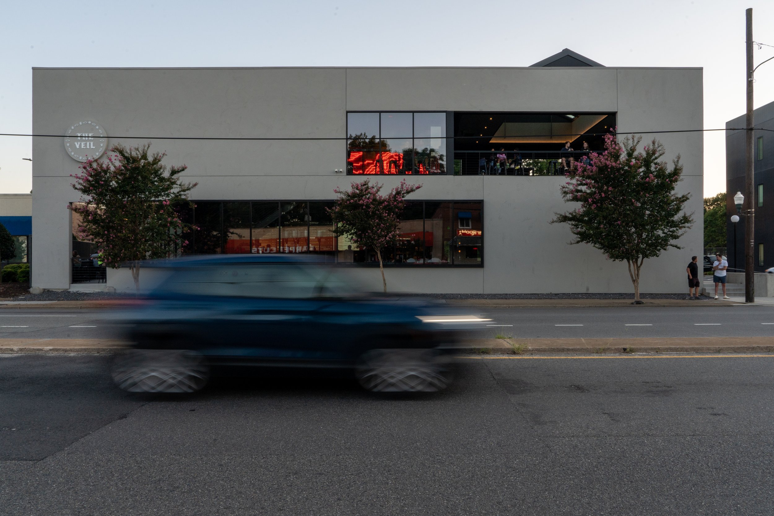
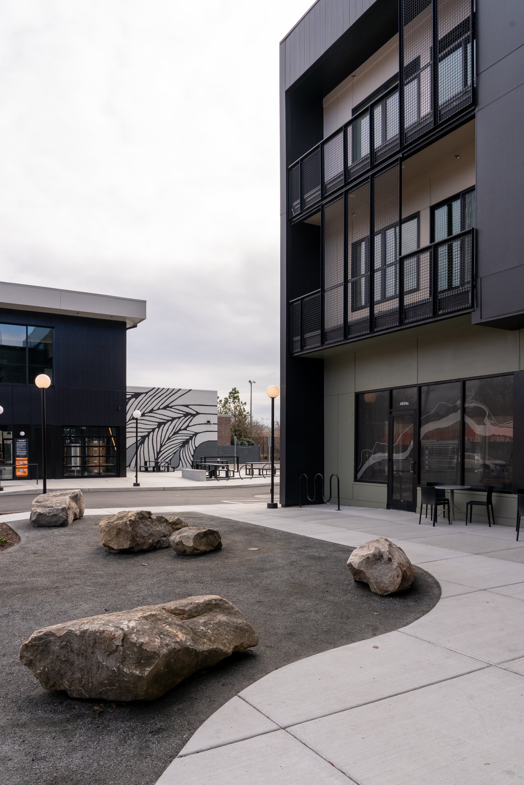
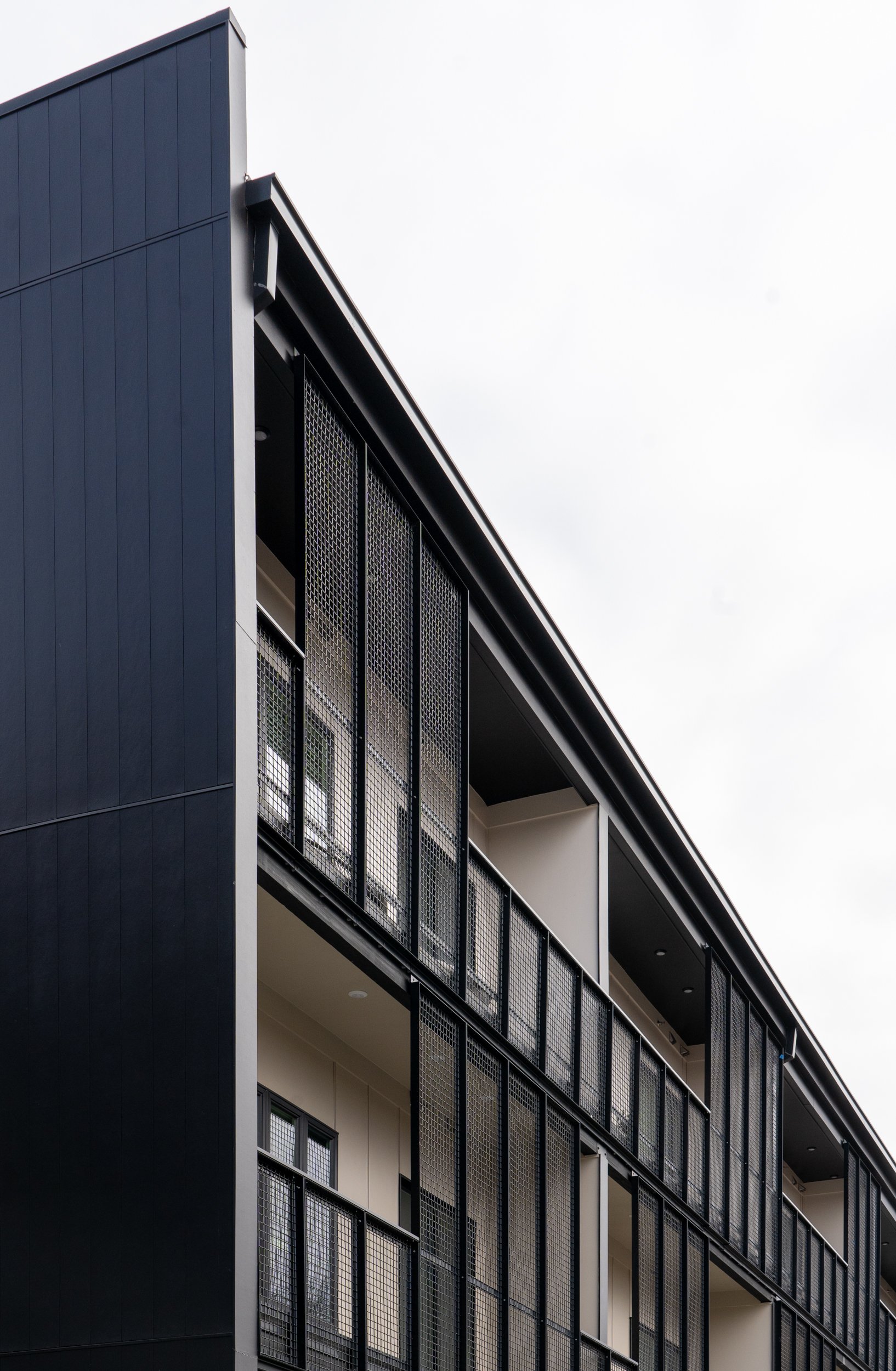
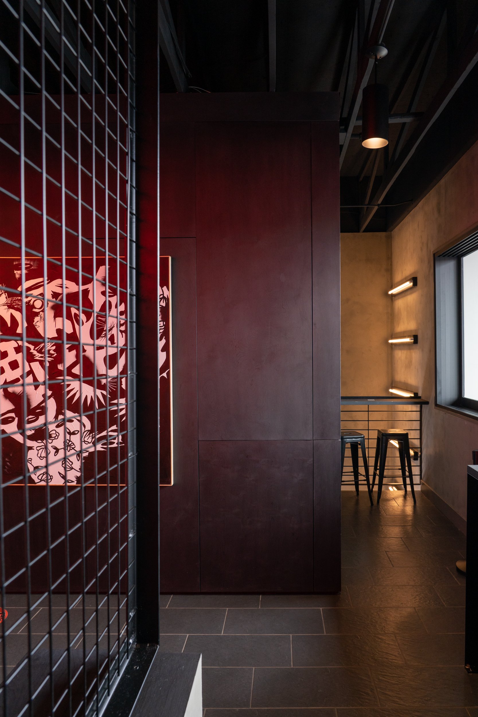
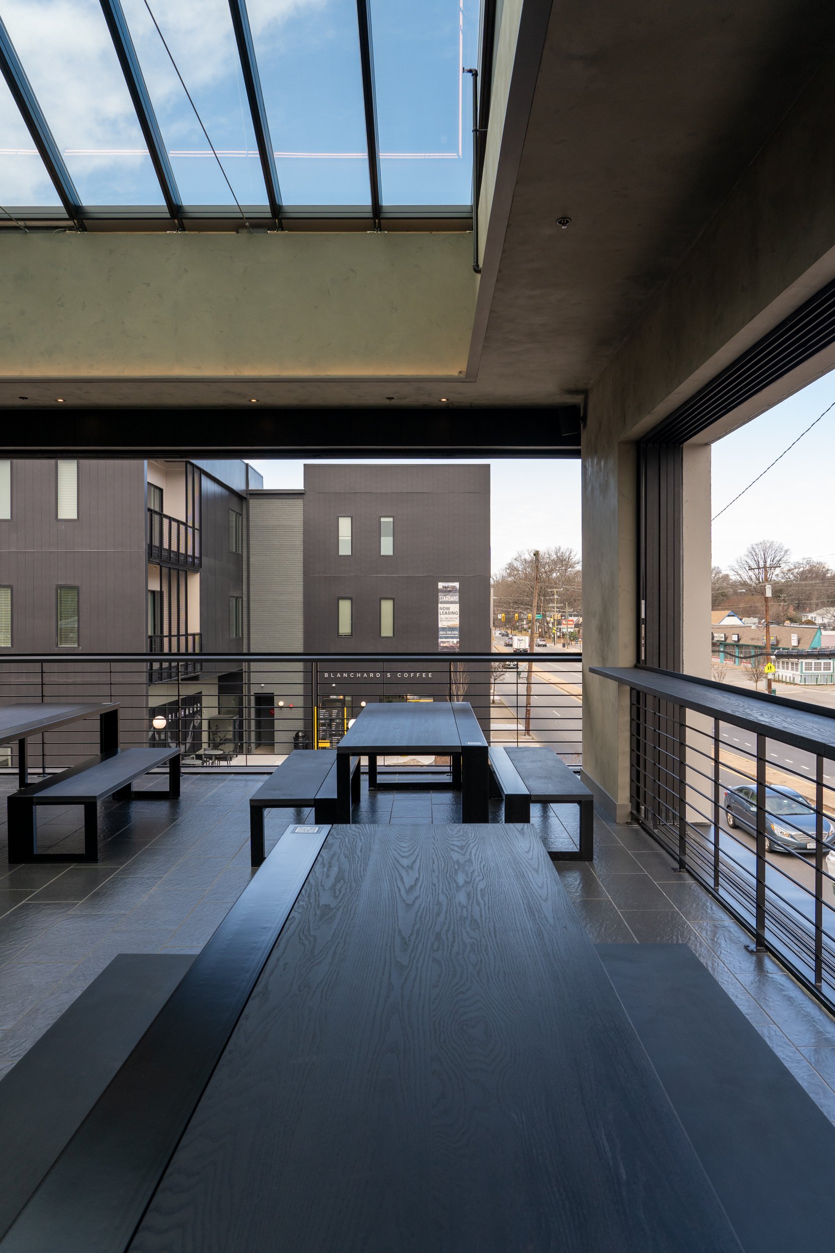
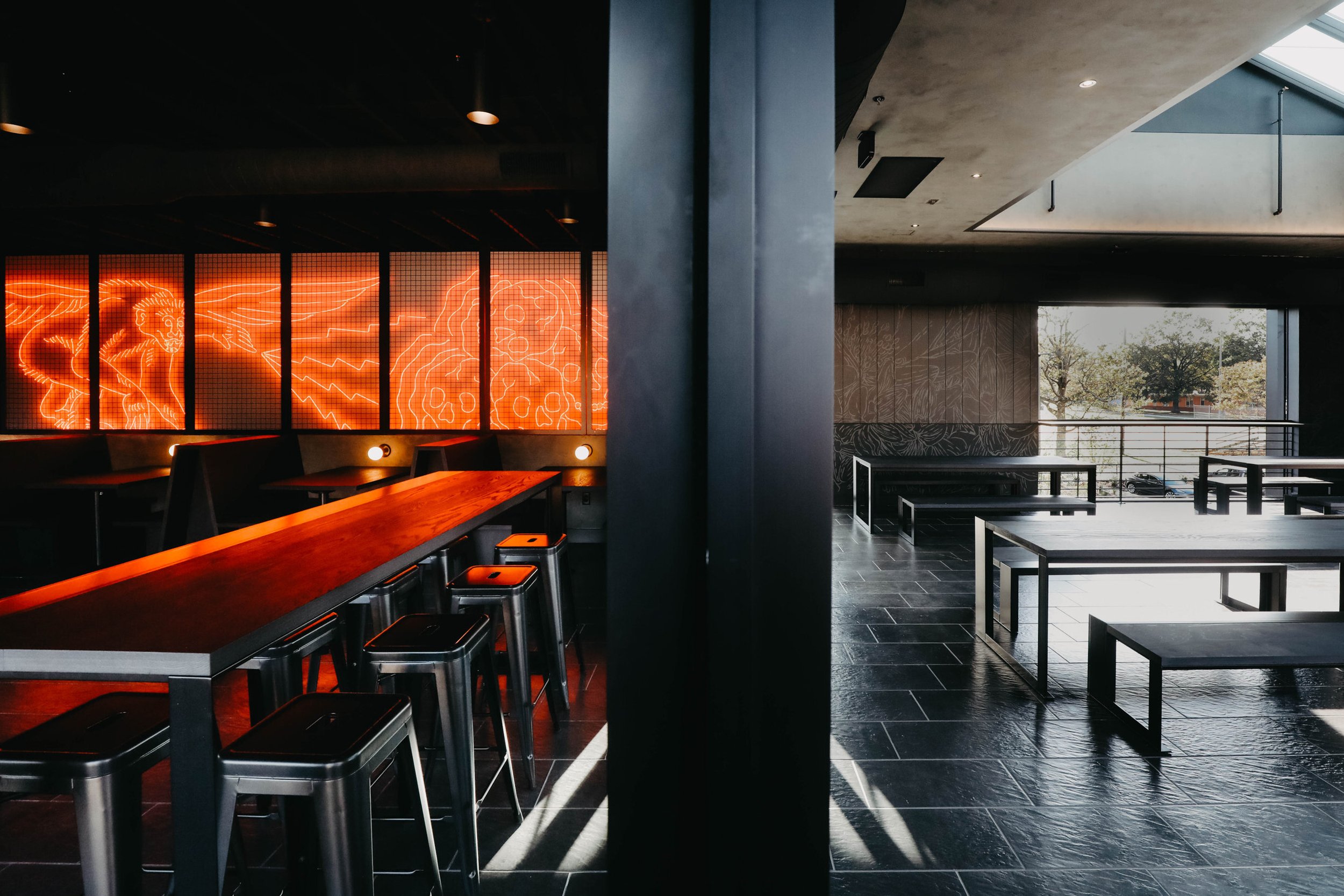
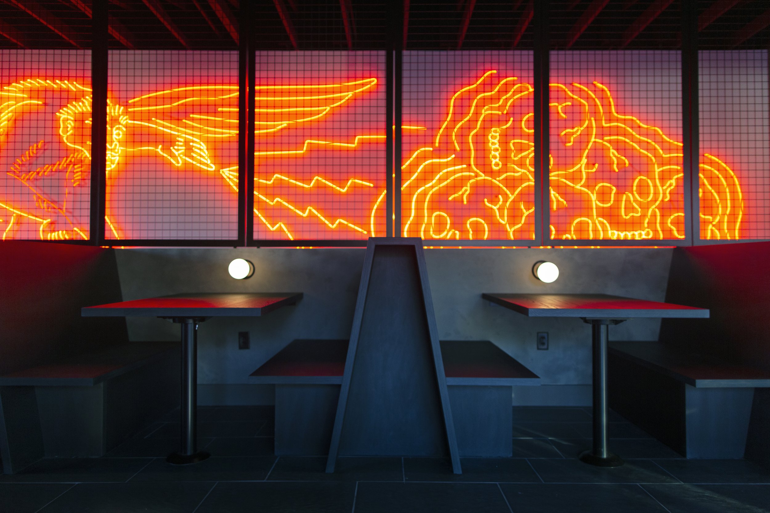
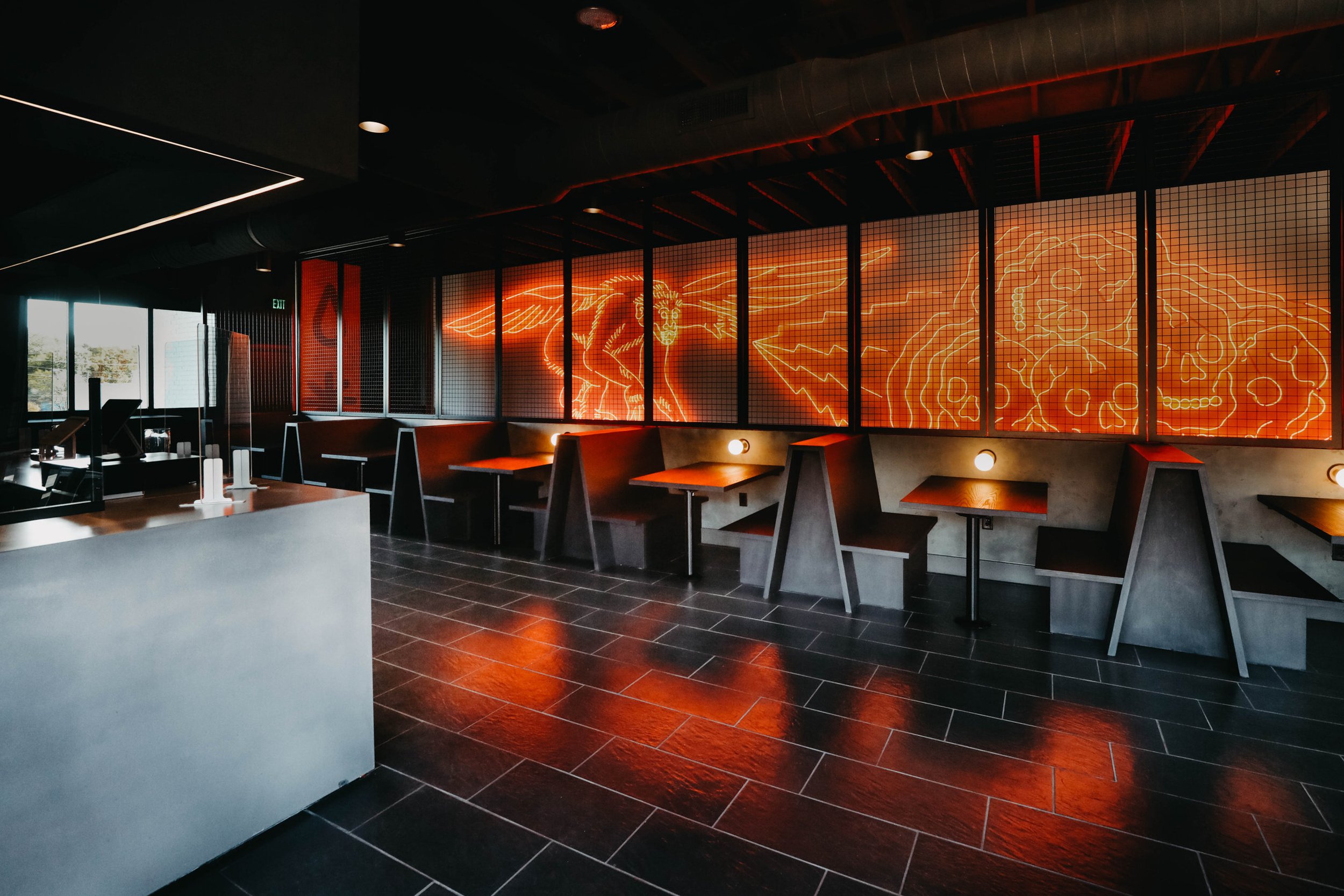
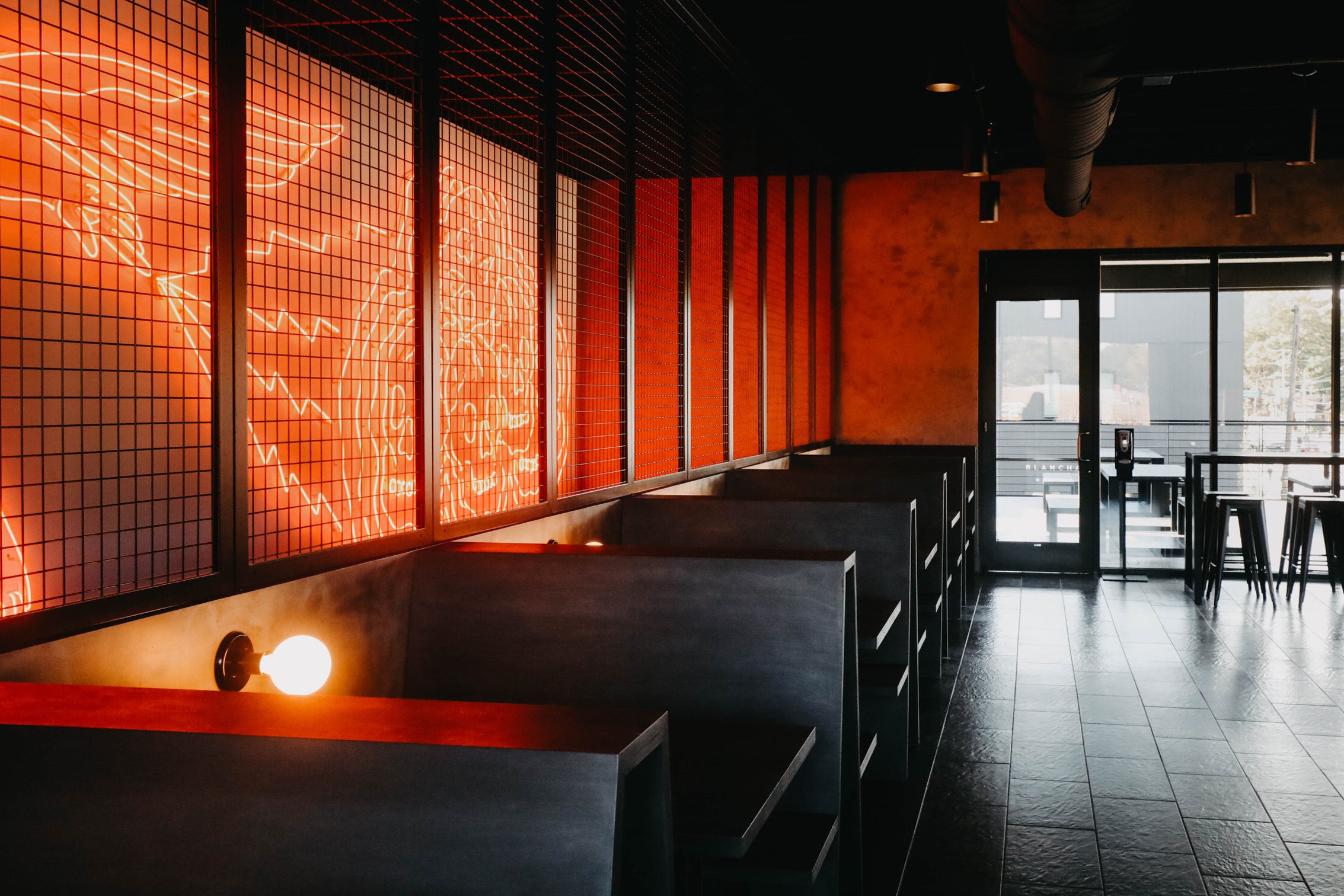
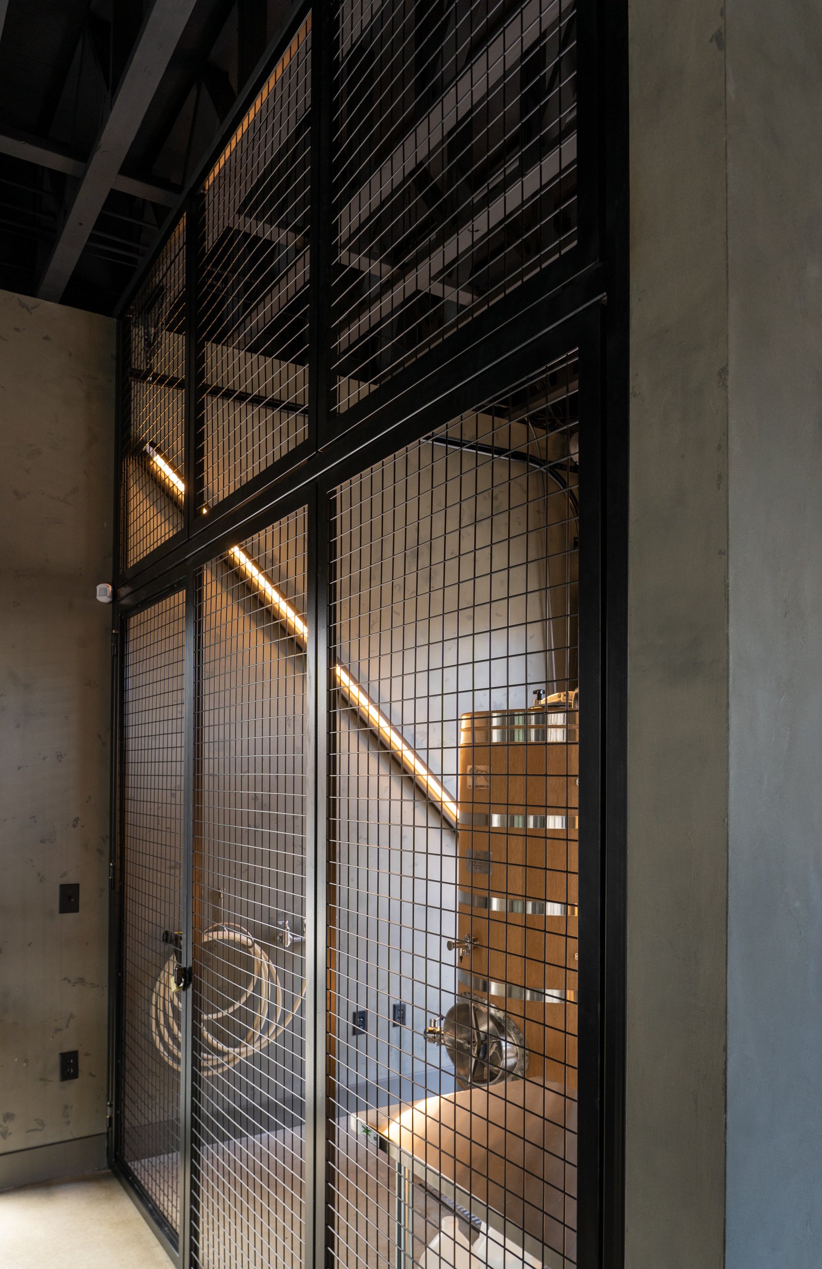
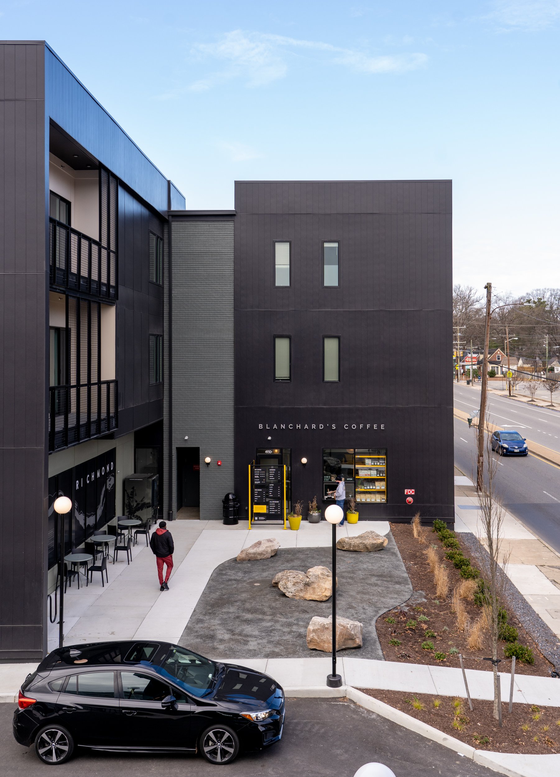
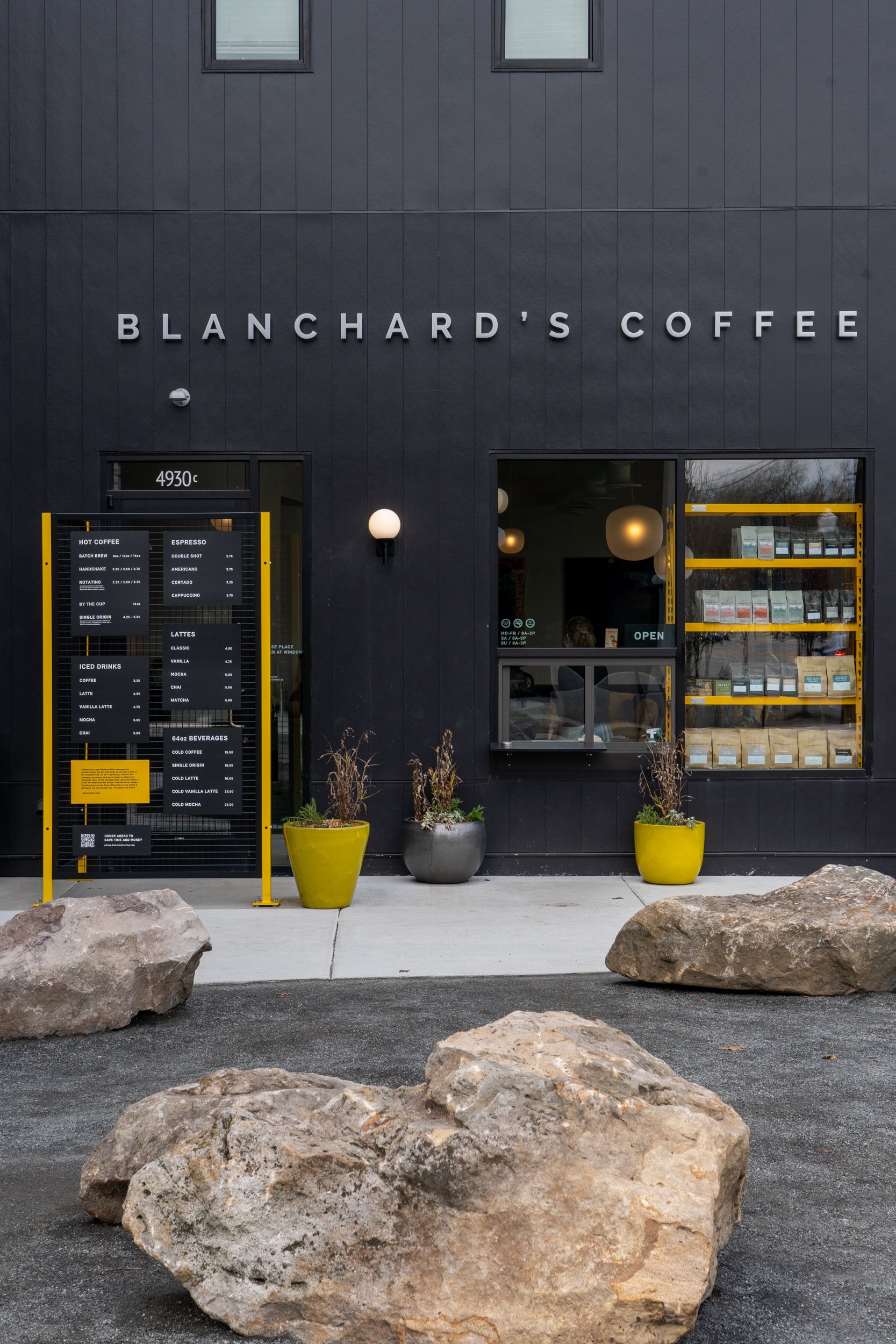
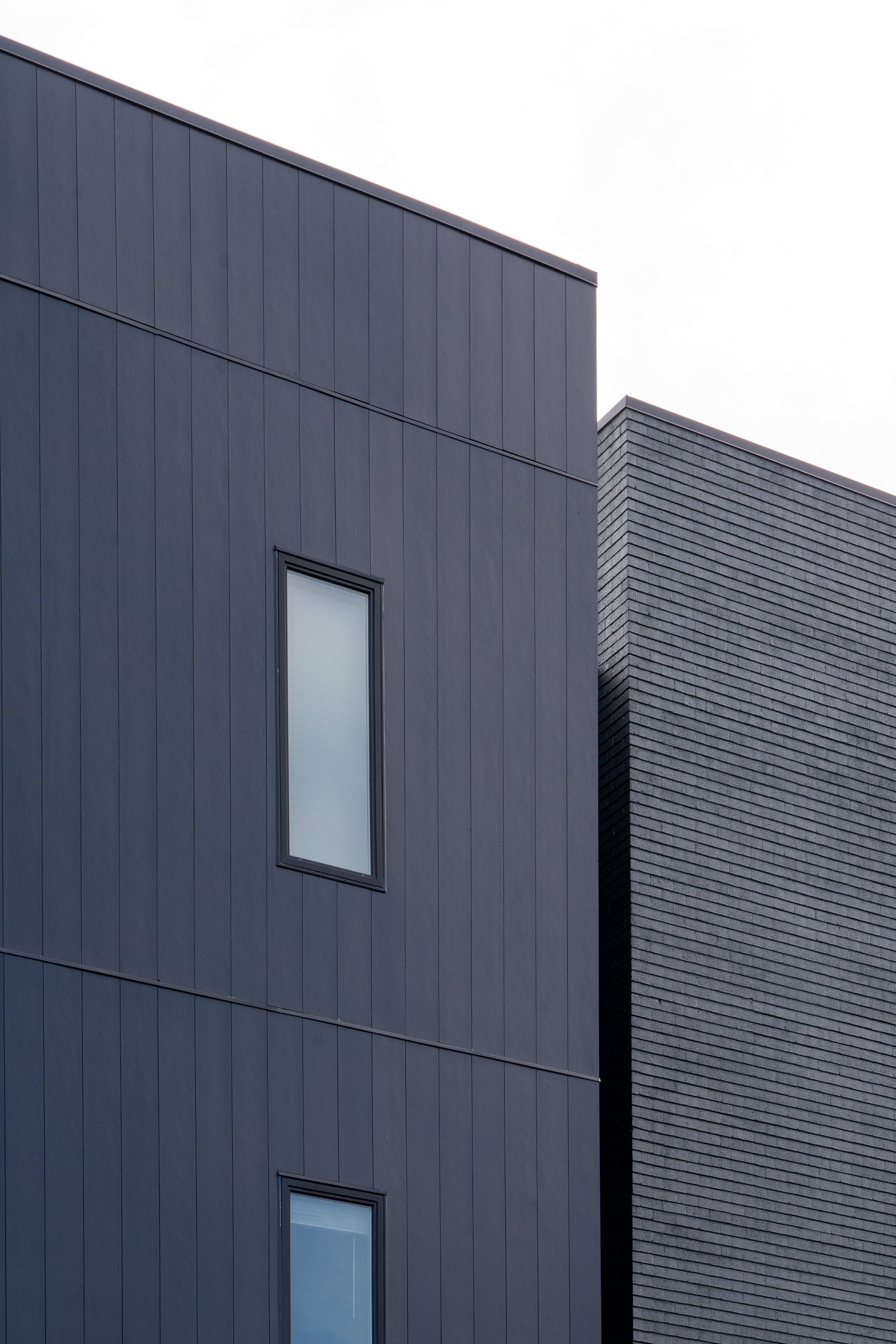
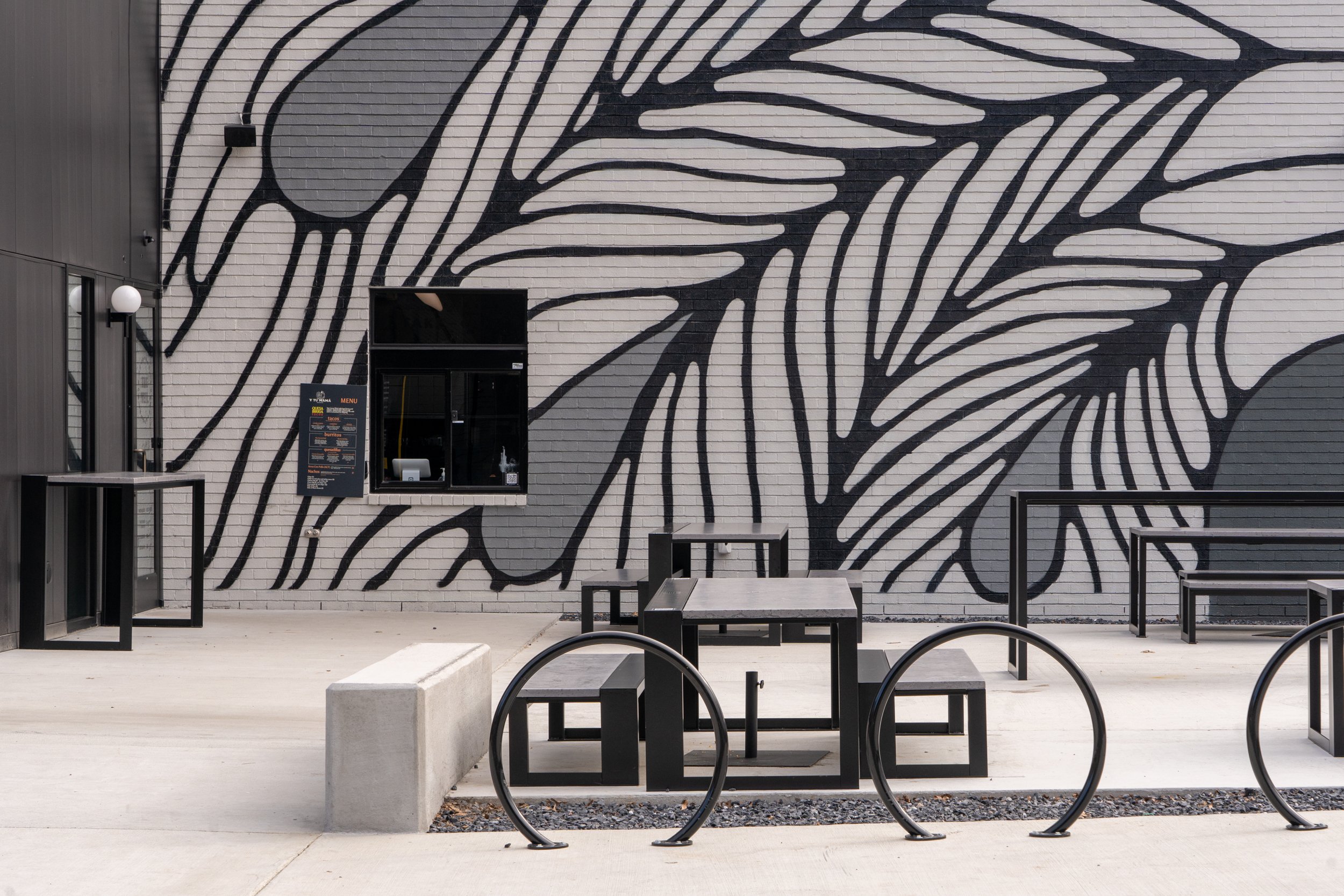
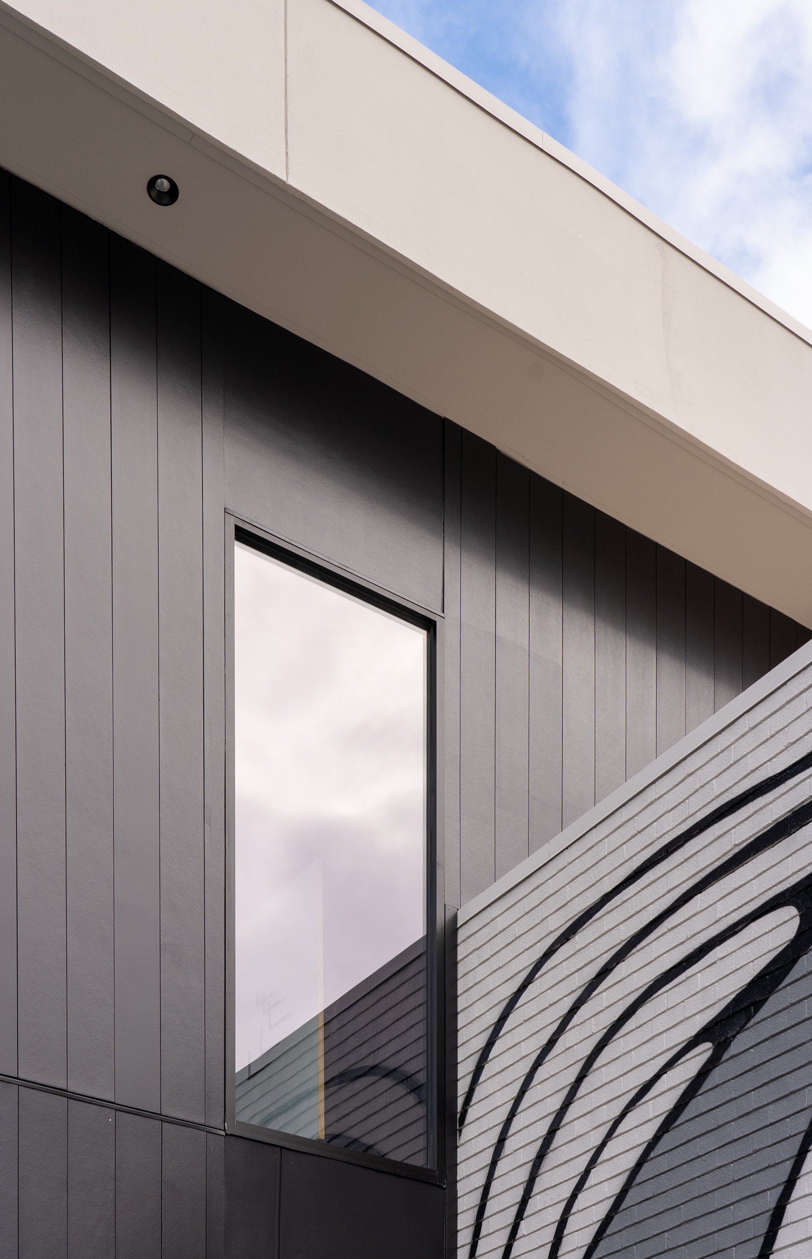
The design of the project takes shape as two distinct but complementary buildings near the street, each with an offset massing that implies volumes that drift past one another. These staggered forms make way for public plaza spaces where the public can linger and engage the retail level, which includes coffee shop, provisions market, fitness, and ice cream tenants. Clean, efficient apartments form a modular texture on the upper levels of the larger building, while the smaller building houses a craft brewery taproom that spills out into the courtyard spaces.
This project brings many community-focused amenities to this neighborhood, a corridor previously dominated by vehicular traffic paradigms. With the initial concept of bringing the massing toward the street and setting the parking behind, the buildings’ presence on the sidewalk became immensely more accessible to pedestrians and more impactful as an urban gesture. The separation of the two buildings allowed a visual and navigable connection to the public park space to the rear of the site, an amenity previously blocked by development on this property. With the creation of offset courtyards on each side of the central drive aisle, the design invites eddies of community gathering spaces that support the local businesses on the ground level, which in turn extend the park space into the site. Overall, a previously barren space has become a safer, more inviting social hub.
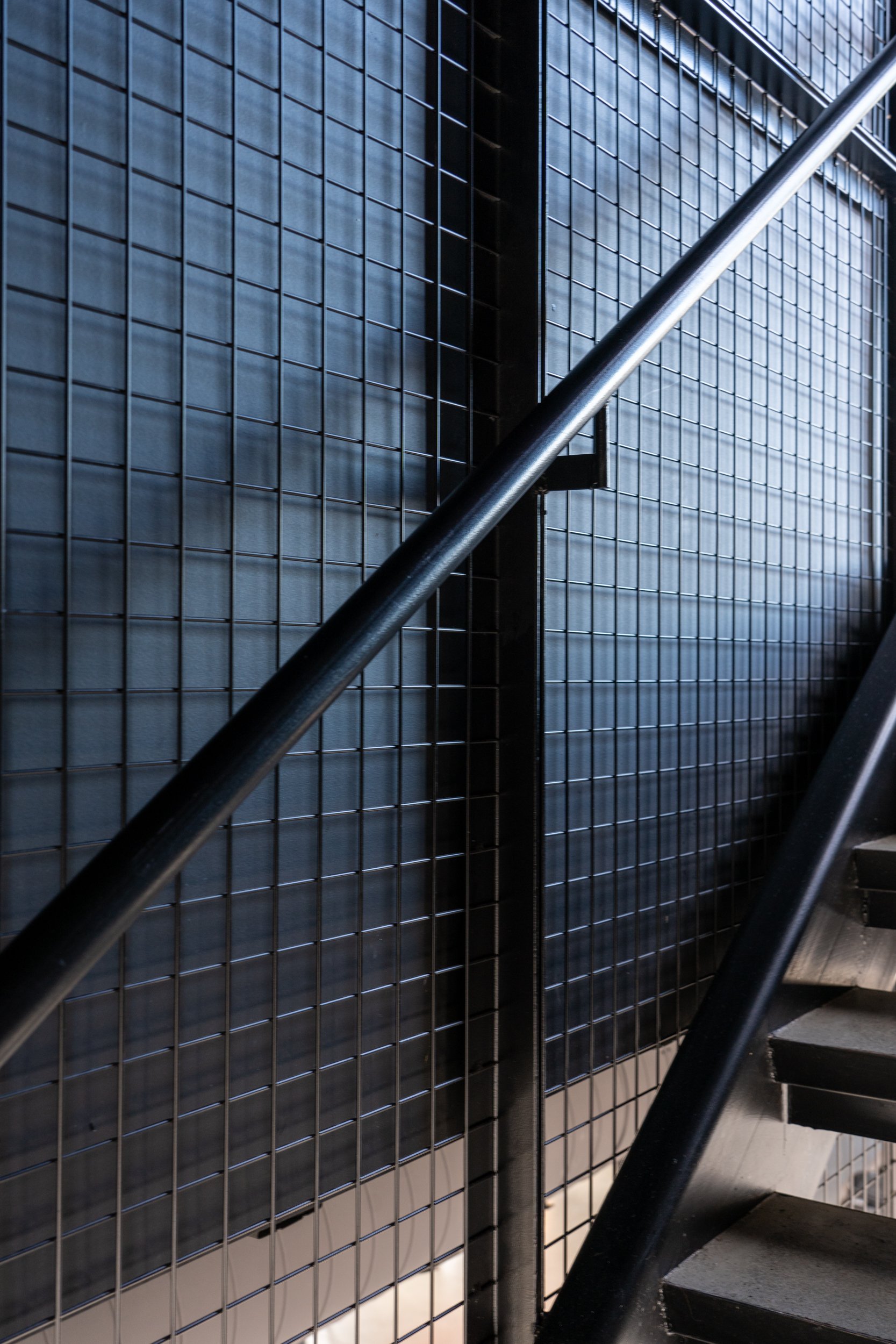
Among the design goals for this project were economy of space and economy of material. The site layout and space planning looked exhaustively at ways to make both the indoor and outdoor spaces efficient while still feeling high end with ample maneuverability throughout. Materially, the project utilized a restrained palette of just a handful of finishes, most of which were selected for their cost efficient price point and locally understood construction methods. By staying on budget with large areas of simple materials, the design was able to reallocate smaller zones of higher end materials such as the custom metal screens on the apartment balconies. Other strategies included using the exact minimum zoning glazing requirement to set the lengths of the storefronts, and elevating a budget-conscious brick specification with meaningful mural graphics from local artists.
With such a community facing project, the design strives to meet the needs of several parties: the developers, the local business flagship tenants, the City’s Parks & Rec, and the surrounding community of local citizens and patrons. Through the process of design, the team solicited input from the community, and continues to work with the city to improve upon the conditions of the site and surroundings to better serve the place as a neighborhood social gathering space. As time goes on, more and more tweaks are made with the addition sensitive alterations by ground floor businesses.
The result is an evolving neighborhood space with capability to improve itself, and a model for an actively engaged community development.
Location: Richmond, VA
Date: 2019
Size: 27,500 SF

